
—David Mitchel, Norton Mitchel Marketing
The matchup for Super Bowl XLVI has now been set. In less than two weeks, about 100 Million people will be watching the New England Patriots play the New York Giants in a rematch from Super Bowl XLII four years ago.
Around Super Bowl time in 2010 and 2011, I wrote about Super Bowl ads in this space. This year, I’m taking a look at the history of Super Bowl logos.
Logos are an integral part of the marketing mix. There are certainly more integral components, but a logo goes a long way. It is how the famous adage of a picture saying 1,000 words is applied in marketing. A lot of brands have obtained an advantage through their logos. Apple, Nike, McDonald’s and BMW are examples of the importance of the logo.
With Super Bowl logos, I evaluated them based on the following components:
- A meaningful connection to professional football. After all, the logo of the Super Bowl is an important part of how the NFL brands itself. Professional sports is a multibillion dollar business.
- A reflection of the host city of the game. Hosting a Super Bowl helps put a city on the map, makes an economic impact for a region and can help attract trade shows, conventions and even tourists to an area.
- How visually appealing it is
- How it stands the test of time
My grading scale was simple. I used A,B,C,D,F, and no pluses/minuses because my undergrad alma mater used that scale.
And speaking of higher education, there is not a trace of grade inflation here. Super Bowl logos earned a cumulative GPA of 2.65.
Special thanks to sportslogos.net. Without that website, this article would have been far more difficult.
Without further delay, here are the reviews.

The only Super Bowl logo without a reference to the Super Bowl in it. Not a major demerit from my point of view because it was unclear where this concept was going. Still a pretty unimaginative logo. I don’t see the reason why Championship and Game are not on the same line.
Grade: D

Credit given for being the first Super Bowl logo to have the word Super Bowl. Some use of color. Simple and elegant.
Grade: B

Incredible use of colors and stars. Was cutting edge compared to its predecessors. Really stands the test of time well.
Grade: A

Super Bowl IV
1969
A let down from the previous year. Very plain, but at least it has more than one dimension to it. Starts the tradition of New Orleans Super Bowl logos having golden colors (Super Bowls VI and XV followed this idea).
Grade: B

Super Bowl V
1970
Maybe this design looked a little ahead of its time, as it has a distinctly groovy 70s feel to it. This is the type of logo that would be expected for a nightclub, concert or van convention, not necessarily an NFL championship game.
Grade: B

Seems pretty advanced for its day. Holds to the test of time well. Upgraded the basic concept of Super Bowl IV. A winner, but not absolute top tier.
Grade: B

This logo looks like the basic idea from Super Bowl V was copied and made a bit snazzier. The shadow works well. Has a Super feel to it.
Grade: B

Simple, elegant, dignified. These are all aspects that are desirable in representing the biggest event for a sport.
Grade: A

Curls make it unique, not unlike many 1970s haircuts. The combination of black and light blue is visually appealing.
Grade: B

Bland and boring. The milk toast of Super Bowl logos. Nothing objectionable, nothing special. Wouldn’t fail or excel in the test of time.
Grade: C

More colorful than its predecessor, Nothing outlandish, and stands the test of time reasonably well.
Grade: B
Very good logo. The game was in New Orleans, and you’ve got the purple and yellow giving a Mardi Gras feel. The lettering stands out compared to immediate predecessors and successor. It just seems fun and holds up pretty well almost 35 years later.
Grade: A

One reviewer on sportslogos.net said that it had a disco feel to it, and I agree with that idea. In January 1979, disco was still huge. So it captures the time well. It doesn’t really look all too special in the test of time though.
Grade: B

The game occurred in January 1980, making it the first game of the 1980s. The logo has a different feel than the 70s era logos, and it goes in a new direction without being a total turn off. It does look like a relic of a by gone era from the 2012 perspective, but it seemed like a good idea at the time.
Grade: B

The Gold of Mardi Gras for New Orleans, and rather simple. The gold and brown go together better than the mustard and brown of the San Diego Padres from the same era.
Grade: B

This was the first Super Bowl in Detroit and the logo designers could have at least found a way to incorporate something related to the American auto industry in this. Phoenix found Southwestern themes when it hosted its first Super Bowl, Miami later used Art Deco and colors to represent the area and New Orleans has always tried to subtly reference Mardi Gras. As a standalone, the logo is adequate.
Grade: C

Lacking colors in the Roman numerals was a mistake. In elements of design, I feel it is more visually appealing to have the words Super Bowl not covering the Roman Numerals, though some Super Bowls successfully design logos in that fashion. This logo is just lacking.
Grade: D

The Super Bowl has used Roman Numerals since the beginning and Roman Numerals in the logo since Super Bowl II. This Super Bowl logo has the most Roman feel to it. The banner with the word Super Bowl on it conjures up images of a Roman Feast, Julius Caesar style. It shows what the game had become in the American cultural landscape. The height of the Roman Empire analogy also works in the context, as a new bull market in equities was still in its infancy and the US economy was improving after the late 70s/early 80s doldrums. However, the next few years would disprove a strong correlation between the stock market/economic conditions and a good Super Bowl logo.
It is also worth mentioning that this is the Super Bowl where Apple’s 1984 ad aired, which is still considered one of the best ads in Super Bowl history.
Grade: A

Weather conditions were somewhat foggy, as is this logo. The gray is dull and the white on navy looks uninspired, like the Miami Dolphins performance that day.
Grade: D

This is a major underachievement. The 20th anniversary is a big deal, and yet the logo isn’t special in any sort of way and looks dated by today’s standards. The game wasn’t much better than the logo, unless you are a Chicago Bears fan, then it was a great game. If this wasn’t a major anniversary year, my rating of this year might be slightly higher.
Grade: D

This is not a good logo at all. The rose doesn’t look all too rosy. It looks more like a downward spiral. The font type of Super Bowl isn’t visually appealing. It doesn’t stand the test time at all. I perceive it as something you might see in an 8th grade art class. This is the nadir of a bad era of Super Bowl logos.
Grade: F

It is a seemingly simple design. It goes wrong in shape. The shape of a baseball diamond is evident. Why are there themes of baseball in football’s biggest game? Doesn’t hold up well over time either.
Grade: D

Another bad logo. What are the triangles for? Super Bowl font isn’t particularly appealing to my eyes. Good game though.
Grade: D

This is an improvement after 5 years of substandard logos. Some degree of complexity involved, which makes it an above average design. The words Super and Bowl are in a little bit of a banner form, and championships can be represented on banners. The game was one of the worst in Super Bowl history though, as the San Francisco 49ers obliterated the Denver Broncos, 55-10. The game was so bad that there was a material impact on the ratings.
Grade: B

Just a great all around logo. Captures the essence of the moment quite well. This is the Silver Anniversary of the Super Bowl, and I see a silver-ish hue to it. The logo is shaped like a Super Bowl ring. Great use of color and type faces. This logo is everything that a marketer would want to see in a logo. Probably the best logo in Super Bowl history.
Grade: A

The image of a football shooting up into the air in the middle of this logo probably appeared cutting edge at the time but just appears dated by today’s standards. The white and red represents nothing about Minneapolis, a city that was making its debut as a Super Bowl host site that year. The Super Bowl has never returned to Minneapolis and fortunately no subsequent Super Bowl logo looked anything like this.
Grade: C

This logo gets the NFL shield like design right and does a much better job of designing roses than Super Bowl XXI at Rose Bowl Stadium 6 years earlier. The XXVII has a good font. But this logo is a little too rosy. Would a floral brand use a football to represent their brand? I think not. Roses don’t align with the image of the Super Bowl.
Grade: B

This is the same idea as the previous year, and the visuals look nice, just like the previous year. A peach represents Atlanta, and this was the first Atlanta Super Bowl. I was critical of Detroit above for not having local elements in their first ever Super Bowl. But peaches are not strongly associated with masculinity in the minds of the target market, as football is.
Grade: B

The sunshine connects to Miami, but the coloration looks more Phoenix. The design looks more 80s, which is disconcerting because the logo was designed in 1994 for a game in January 1995. No connection to football whatsoever. The effort could have been much better.
Grade: F

This is tremendous. First, the designers had a challenge that hadn’t been seen prior to this. XXX equals 30 in Roman Numerals, but in English lettering, it is closely associated with the adult film industry. The designers were able to take the focus away from that by making the X’s different sizes. This was also the first Super Bowl in the Phoenix metropolitan area, and Southwestern motifs are quite evident through the use of colors (red & turquoise) and shapes (looks quite Navajo). It has a fun feel to it.
Grade: A

This is a fun and festive logo. Of all the New Orleans games, it captures Mardi Gras the best. Many people have associations of a real good time with Mardi Gras. You can see a crown in this logo, and the winner of the game is crowned champion of the NFL for the season. It uses gold like previous New Orleans Super Bowls (XV for example). One couldn’t really ask for better execution of a good concept.
Grade: A

This is a logo that hasn’t aged too well. It has a distinctly 90s look. The separate boxes for each Roman Numeral except for II doesn’t work that well. You can see Naval themes in it, which makes sense since this game was in San Diego. It is passable. And certainly a better effort than the previous San Diego game 10 years earlier.
Grade: C

This is a logo that probably had good intentions, but the execution wasn’t there. You can see some Art Deco elements, which makes sense since the game was in Miami. Overall the logo looks a little bit too busy, but it does look like it’s capturing a fun moment. This was a fun time for a lot of Americans, as the economy was doing well due to the dot com boom.
Grade: C

The NFL shield is a prominent part of this logo, which means it understands its purpose. Having the year 2000 in the logo was very cool at the time, but makes this thing more dated quickly. That’s still a minor quibble. The coloring is great. Pretty much all that a Super Bowl logo needs to be-connecting to football and getting people excited about the big game.
Grade: A

This is Super Bowl XXIV’s logo in spirit, updated for the new century. The silver background adds a nice touch. This looks like it lacks for ideas, as it doesn’t have any strong connection to football (though the silver background could be interpreted as a championship belt-but then again when have championship belts been used in football?). This doesn’t represent Tampa in any way either, though the logos for Super Bowls XVIII and XXV in Tampa were not very reflective of Tampa either.
Grade: C

Patriotism was in the air post 9/11, and this logo was a late replacement for another more Mardi Gras esque New Orleans logo. It would be un American to not like the red, white & blue here. This captures the mood of the time and can even serve to show that the NFL and the Super Bowl can unite a nation amidst a time of crisis.
Grade: A

Oceanic themes abound, as this was the third game (and final to date) in San Diego. Visually, it is appealing. It seems serene, and maybe captures a relaxing day on Pacific Beach more than the intensity of the biggest football game of the year.
Grade: B

The stars and space themes are nice, given that this was the first Super Bowl in Houston in 30 years, and may be the last one in Houston for a while. The colors don’t really add anything to this from a marketing standpoint.
Grade: C

The best thing that can be said is that this logo isn’t as bad as Jacksonville as a host city. There was a lot of negative feedback about the way Jacksonville put on a Super Bowl. I like the wave at the bottom visually, but fail to see its relevance to football. At first glance, the bridge in the background may look like a goalpost, but upon closer examination, it loses its flair when you realize that it is really a bridge.
Grade: D

Simple, which isn’t a bad thing. The words Super Bowl being over the XL detract from it. XL in non Roman numeral meaning means extra large, and the Super Bowl is an extra large celebration. Therefore, I think that the XL should have been left to celebrate its XL-ness in an extra large fashion and the words Super Bowl should have been above or below it. The red and blue consistency is nice.
Grade: B

A winner, like the Colts that year. The I is representative of a goal line pylon and there’s a football at the edge. A star shines bright here, and this is the biggest stage for star players to shine. The logo would have been even better if the words Super Bowl were not splattered across the XL. In the grand scheme of this design, that is minor.
Grade: A

Great game, not so great logo. This logo tries to get the Arizona feel of Super Bowl XXX, but fails. The maroonish red and turquoise are okay, but there is just too much red. The shooting stars fall flat. Arizona isn’t quite geographically accurate here. A logo somehow involving the Grand Canyon or cacti would have captured Arizona better.
Grade: D

This might seem boring at first glance, but it has real substance to it. The field part of the logo is nice, and the blue color part of the field represents the end zone. A team generally needs to reach the end zone to score points and a team has to score points to win. The words Super Bowl XLIII above the end zone represent the purpose of scoring points and winning. This is the thinking person’s logo.
Grade: A

Another year, another winning logo. The logo uses lettering in a way that it had never been used before. Creating uprights between the L and I in XLIV was great and a football is on its way through the uprights. Special teams matter in football, and it is a generally unheralded part of the game. The logo connects meaningfully to the game and to the host city of Miami. The Dolphins have always had the color orange as a part of their logos and orange like pastel colors were a part of Don Johnson’s Sonny Crockett character on Miami Vice.
Grade: A

The Lombardi Trophy, a powerful font, a strong silver finish and the game’s stadium. This gets the point across successfully.
Grade: A

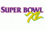
Last year’s logo was brilliant in its simplicity. So why not re-run it for the next year? After all, consistency is a good thing in branding. I’ve praised Coca-Cola in this space for its consistency in branding. However, this isn’t Ccca-Cola. Also, this isn’t the NBA Finals, which has been known to keep the same logos for years. This style NBA Finals logo was used from 1986-1995. The Super Bowl has been known to change logos annually, and that’s a part of the brand of the game. This is the first time that the NFL has basically recycled a logo. Because the logo is so strong, it’s not that bad, but I think some elements should change next year.
According to this article, the NFL has used Landor Associates as their brand consultant. I am a proponent of many of Landor’s ideas and use them as a guideline in aspects of my brand consulting work. Landor is looking to have the NFL create a consistent approach in Super Bowl logos. According to Landor, there needs to be a defining symbol in the logos of a big game, like the Olympic rings. And that’s a good idea. The execution is where problems arise.
The Lombardi Trophy can serve as the element of consistent branding, like the Olympic rings. However, other elements of the design can change over time, and it would work well. For example, not every Olympic logo is formulaic like the last 2 Super Bowls. The words Super Bowl and the Roman Numerals don’t need to be in the same font every time. Nor does the stadium need to be in the background. The stadium being in the background worked well last year for Cowboys Stadium, as it definitely has a one of a kind feel. Lucas Oil Stadium in Indianapolis isn’t as well known for stadium design.
Grade: B