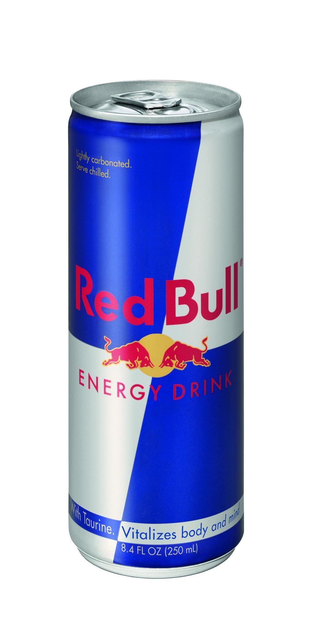
Commercial Impression

As you may recall from March of this year, we blogged about Kimberly-Clark’s novel intent-to-use trademark application for a "sensory, touch mark" in connection with disposable paper hand-towels. Other discussions of sensory, touch marks may be found here

In any event, the original description of the claimed Kimberly-Clark trademark was as follows: "The

La Mer The Body Creme

Millimeters apart on the label, miles apart in meaning. Yes, a few extra millimeters of blank space can make all the difference in the world for some brands. Especially when the brand name consists of two words, and the typical visual treatment has all letters appearing in identical size and style (all caps), and when compressing the words yields an unintended, unfavorable meaning. Take the above luxury skin care brand owned by La Mer Technology, one of the Estee Lauder companies.

Honestly, I’m not sure how, but a few weeks ago, I came across Felicia Sullivan’s blog post "Covet Fall’s Top 10 Beauty Indulgences" on The Huffington Post, featuring the above product image. I took a double take at the brand name, laughed out loud (initially thinking it was a spoof product), and after realizing it wasn’t, I knew I couldn’t resist writing about it.

Part of my due diligence involved questioning my wife about it, she being far more experienced in these kinds of matters. I was "kindly" informed that "anybody who is anyone" knows La Mer is a coveted luxury skin care brand. Since being educated, I now introduce my wife as anyone, and myself as no one. Ironically, you might say I fit at least one slang definition of "lamer" — "a person who is out of touch with modern fads or trends, esp. one who is unsophisticated." There are other meanings too, that I suspect don’t implicate the target market for $130 an ounce skin care products, or value-priced 16.5 ounce containers at $1,390. Just so you know, I also have come to know that anyone who knows anything about the French language knows La Mer means "the sea".Continue Reading Essential Spacing: Night & Day Commercial Impressions

Recently, UnderConsideration’s Brand New blog commented on the new logo adopted by Much Music. After 10 years of using MUCHMOREMUSIC, the logo was changed to MUCHMORE. The new logo is aesthetically more pleasing, but the change raises an important issue. Modernizing old logos can result in abandonment of the old mark, which means a loss of all trademark