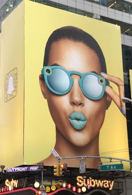
For a few months now, the Minneapolis skyway system has been flooded with a variety of fresh, creative, eye-popping advertising to promote Pepsi’s new bubly sparkling water collection:

Although not a lie (the bottles I’ve seen clearly reference Pepsi), you’d never know from this ad or the trademark registration that Pepsi is behind bubly, since

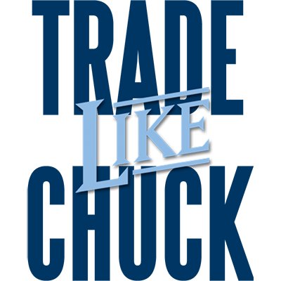
A recent advertisement caught my ear because it involved financial services offered by a guy named Charles Hughes a/k/a Chuck Hughes and the catchy marketing phrase Trade Like Chuck:

It instantly reminded me of a piece I wrote in 2010 called: Exposing Two-Face Brands. One of the branding truncation examples I wrote about

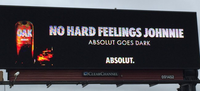
It has been a while since a billboard campaign has caught my interest and attention, but the currently running Absolut Goes Dark ads are an exception worth noting:

AbsolutJack

AbsolutJohnnie

AbsolutJim

Isn’t it interesting — at least in this context — how the simple references to Jack, Johnnie, and Jim, draw an obvious comparison to the distilled spirits

Ernst & Young, here is to hoping you can take a little joke about your new truncated name, EY:

We’ve written a lot about the potential hazards of brand truncation here, and when one of our talented guest bloggers brings this unfortunate story to our attention, we simply couldn’t resist spilling a little digital

The letter "W" is an interesting one. Besides being the twenty-third letter in the alphabet, it is the only one having more than one syllable; it has three — unless it is pronounced with two: dub-yah.

It is more than a bit ironic that — as a truncated single-letter brand — W, in most cases, has three times the syllables

We have been following the truncation trend to single-letter branding symbols for some time now.

Visa appears to be heading in this direction with the relatively new V logo:


Based on trademark filings at the USPTO, it appears Visa began using this single-letter V logo by itself back in 2008 with the launch of

I’m not talking about brands that say one thing and do another. I’m not talking about brands that don’t live up to their promise. I’m literally talking about brands with two faces. One face may be confident, complicated, technical, professional, and/or formal. Let’s call him, Stephen. The other face might be friendly, simple, approachable, engaging, and/or informal

My trademark antennas automatically rise when I hear about a brand owner announcing plans to trade in one brand for another, as GM recently and surprisingly did with the Chevy nickname (brand and trademark), in favor of the longer and more formal Chevrolet brand name (and trademark). Hat tip to Nils Montan of IPAlly, for spotting